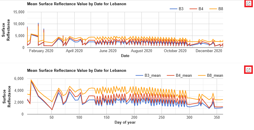
Time Series Chart
As the last step for the first topic, we will have a look on how to print charts from our accessed data. This can be done via the command ui.Chart.image. To find a comprehensive list of all the different ways of visualizing your images and features as charts, browse the Docs tab for ui.Chart.
We will start by printing a diagram of the mean surface reflectance values of our accessed research area over the whole timespan of one year. To keep it simple and clear, we will only consider the values of bands 3, 4 and 8; the same we used to visualize in our previous analyses.
var chart = ui.Chart.image
  .series({
    imageCollection: s2a_cloudfree.select('B3','B4','B8'),
    region: extent_lebanon,
    reducer: ee.Reducer.mean(),
    scale: 200
     })
  .setOptions({
          title: 'Mean Surface Reflectance Value by Date for Lebanon',
          hAxis: {title: 'Date', titleTextStyle: {italic: false, bold: true}},
          vAxis: {title: 'Surface Reflectance',titleTextStyle: {italic: false, bold: true}},
  });

print(chart);
Day-of-Year-Chart
Another approach to visualizing this information is to print it as a day-of-year-chart. Depending on your research interest, this might be more accessible and easy to read.
var doychart = ui.Chart.image
  .doySeries({
    imageCollection: s2a_cloudfree.select('B3','B4','B8'),
    region: extent_lebanon,
    regionReducer: ee.Reducer.mean(),
    scale: 200,
    yearReducer: ee.Reducer.mean(),
    startDay: 1,
    endDay: 365
  })
  .setOptions({
          title: 'Mean Surface Reflectance Value by Date for Lebanon',
          hAxis: {title: 'Day of year', titleTextStyle: {italic: false, bold: true}},
          vAxis: {title: 'Surface Reflectance',titleTextStyle: {italic: false, bold: true}},
  });

print(doychart);
By clicking on the upper right icon of the printed charts, you can open a more detailed visualization in an external window. Here, you can also export the chart in high quality as .csv, .svg or .png.
